


Niyo Premium
Creating a design system for the Premium arm of Niyo
DESIGN SYSTEM

01. The goal: Increasing CLTV*
*customer life time value
The "Premium as a Platform" feature enables Niyo to offer and manage yearly subscription plans, with benefits like increased rewards and free international lounge access. Cancellations or upgrades are out of scope for now.
Designed to boost Customer Lifetime Value, it supports plan discovery, purchase, renewal, and fulfilment through a modular system that integrates seamlessly with the app interface. This ensures a premium, user-focused banking experience while fostering customer loyalty.
My Role
UX designer on the project supervised by Mr. Shreyas Chaudhary.
Duration
3 months (from design to development)


Strategy
02. The fight: KISS approach or flexibility
It's always a fight between product, design and business
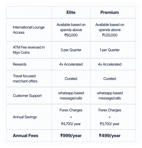
The initial benefits draft reveals minimal differentiation between the plans, which could lead to decision paralysis . From a UX perspective, a single-plan approach would simplify the decision-making process, enhance clarity, and create a more seamless buying experience.
SINGLE PLAN
vs.
MULTIPLE PLAN
Less friction as the user doesn’t have to decide within multiple plans
Clean & clear structure & comms
More system wide scalability
Restricted options
Generic benefits to different demographics
More personalised options for different types of travellers
Cater to multiple price ranges
Higher cognitive friction due to added decision
Complex system wide scalability
Verdict
However, design team recognised the business's goal to maintain flexibility for multiple plans, even though the structure presents scalability challenges.
Product
Designer
*Design
*Strategy
03
ONE

SYSTEM

MULTIPLE TOUCHPOINTS

PREMIUM

REWARDS

TRAVEL

BANKING

The nature of the project required me to introduce touchpoint at major activity/high traffic junctions in the app, with a capability to transform based on user's membership status. The goal is simple to sell by highlight the benefits and create constant value without being over powering to the current task.


TOUCHPOINTS
homepage
profile
hub
lounge
payment summary
checkout
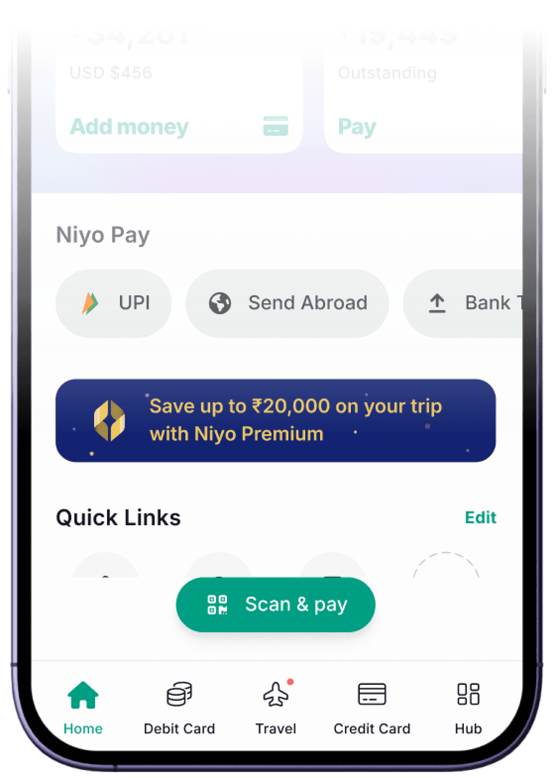
Promotional banners for new users.
The membership page is designed to accommodate multiple plans but works with a single plan as well. The communication and touch point system is designed to focus on premium tier more than the individual plans. This results in minimal changes in case of a plan rollback and creates a single elevated identity for users on the surface.
Multi-Plan

Single Plan

This gave me an opportunity to understand and collaborate with different verticals in the organisation, as the touch points were spaced over travel to banking from intro pages to checkout. This required me to come up with a universally consistent system for different kind of communications, before and after membership activation.

04. The Atomics


System Tokens
With our design system up for a revamp, the tokens were created to fit the old as well as the new design system. I had to make sure to come up with a visual language that stands out but marries well with the existing designs, so that it is easy to scalable across different components as well as verticals.
Keywords
from founders
RICH
EXPENSIVE
LUXURY
MODERN
MATURE
LUXURY
/ˈlʌkʃ(ə)ri/
a state of great comfort or elegance.
Creating an identity
Initially it felt like tweaking the brand logo, should do the trick . But as we were building the component system, we realised a distinct symbol was needed to establish the premium identity throughout the app.
Symbol


Endless
Possibilities
Although a cliché in finance and tier plans, a metallic approach allows strategy to experiment with a number of different plans, for different demographics and hierarchies.
Colours


That
Standout


And finally, some glitter
Membership Page
Creating value
The membership page is the single source of truth for the system. This required us to think beyond simply selling benefits, as the majority of the plan benefits were conditional. However, our primary concern was creating a clear contrast between plans with nearly identical benefits and a vague idea of the structure, while product & strategy teams were simultaneously defining it.
Plan card carousel approach enables the modularity
Allows users to focus on one plan at a time, reducing the cognitive load. The carousel also eases the adding or subtracting a plan, without affecting the membership itself.

The introductory card focuses on premium while the styling & color creates contrast between the plans


Benefits focus on the variable factor to differentiate between the plans.


Saving numbers help to cement benefits for users.


After Activation
After activation, the membership page reflects on the benefits promised. The users are not only linked to the concerned VAS, but also are informed about their status and how redeem them in a precise manner.


Components
Reeling them in
Since, the ingress points (permanent or temporary) are scattered throughout the app, we decided to use the design tokens to decentralise the creation process of these touch points. These tokens can be implemented as a skin on top of our existing components by respective VAS.


drag & drop to see the magic happen
This is an interactive space. Shoutout to Claude.ai for helping me create this component.


Learnings for the journey ahead……
Reflecting on user data
Unlike my stock portfolio, it was delightful as a designer to see the initial reception (despite of the limited external marketing of the plans). This validates the team's assumption that, our existing customers don't mind paying a little extra for
additional travel benefits.
28,381 plans activated,
in the first month of the release.
But the 8.2% conversion rate for onboarding card users, shows some reluctance from new users to upgrade. For the future, we need to structure the plans around more contextual entry points to highlight the lack of benefits in order to create desirability.
After that an average of
750 plan activation per month
approx. 8.2% conversion rate for
onboarding card users.

Looking for my next Big Adventure
Every design has a story;
I'm here to listen and try to
tell mine.

PRAGYA GOENKA
बाबुमोशाय, ज़िंदगी बड़ी होनी चाहिए, लंबी नहीं...


Hi! I am Pragya Goenka, a product designer.
Enjoy the experience on a desktop screen, instead of scrolling through a long mobile page.
