Feb 2026
Optimising Shipment Creation Form for Power Users
Easyship is a leading global shipping platform that connects merchants to over 250+ carriers (USPS, FedEx, UPS, DHL, and regional specialists) through a unified interface, enabling real-time rate comparison, label generation, tracking, and returns management.
The idea here was to revamp their manual shipment creation flow, for small volume shippers. To ship a shipment, a merchant needs to generate a label with basic details like to and from addresses, box and item details, customs or VAT details etc.
Role
Product Designer(solo)
Duration
4 Weeks
Tools


But why rethink shipment creation form?
The Create Shipment form was structured as a five-step progressive workflow that guides users from origin to payment. Each step collects a specific category of information, validates it, and unlocks the next stage. This phased approach breaks down a complex, information-dense process into digestible sections for new users.
The issue arises with the fact that our users using this flow are power users, they have to create multiple shipments a day. When the users repeats this flow multiple times a day, the multi-step approach made to aid a new user becomes friction for repeated use.


Please move the recalculate postage button to the same window that shows the package sizes and weights. This would be a huge time saver.
-That one user annoyed enough to reach out
Current
Experience
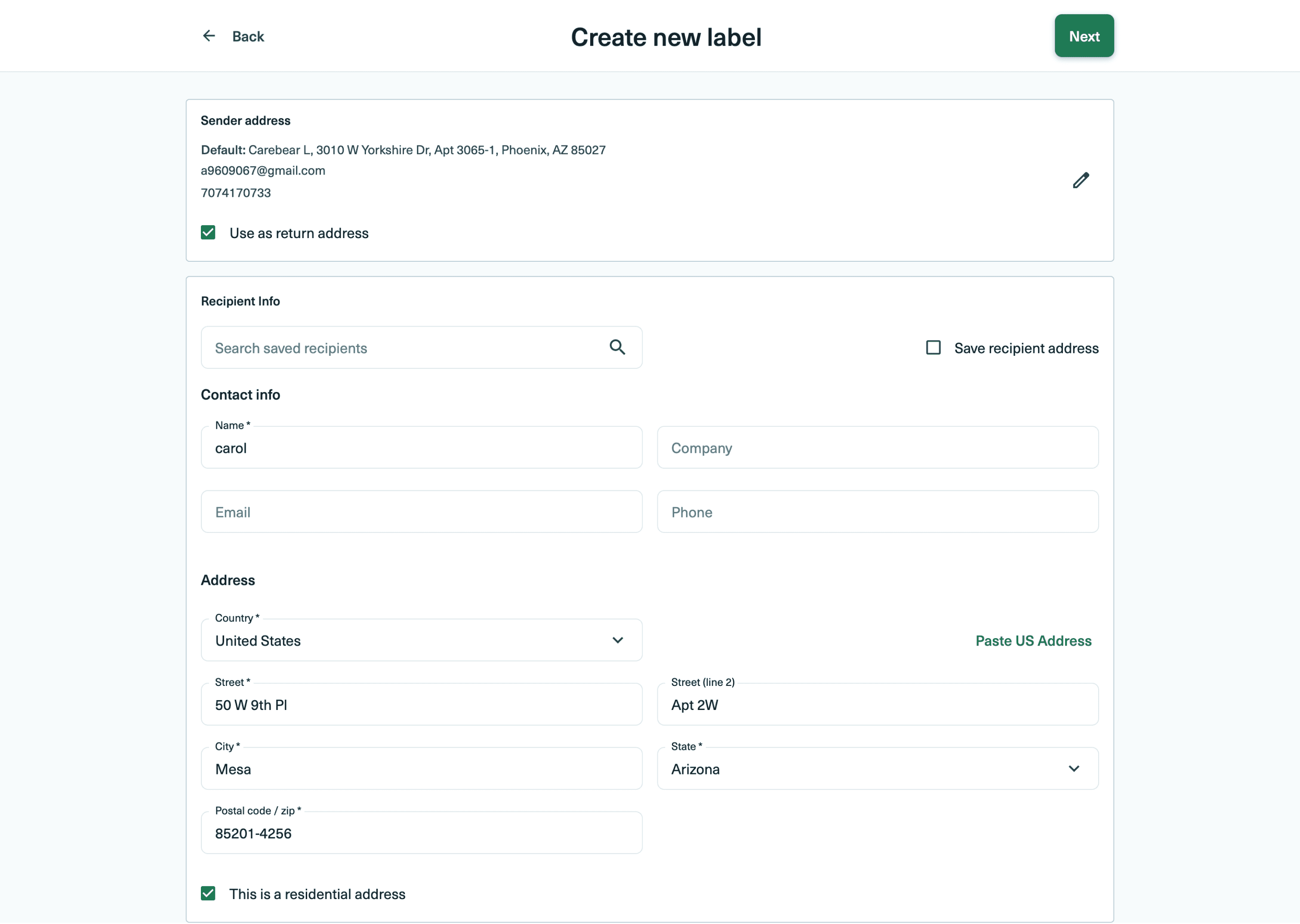
Step 1: Addresses

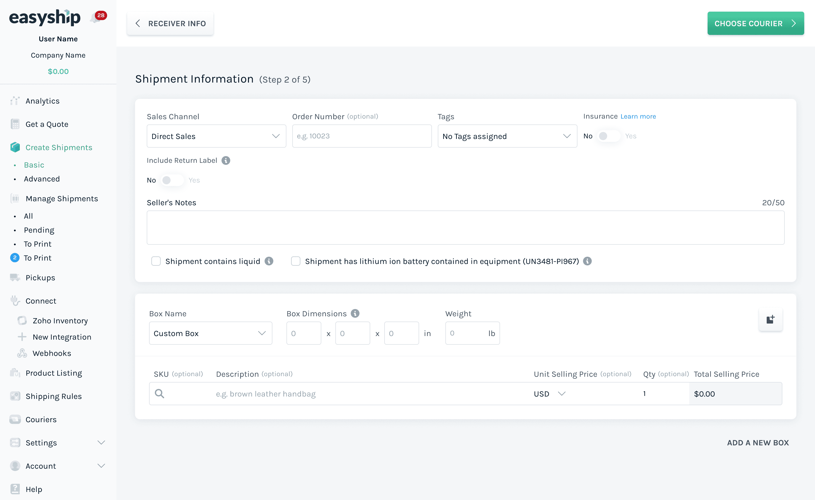
Step 2: Shipment Information
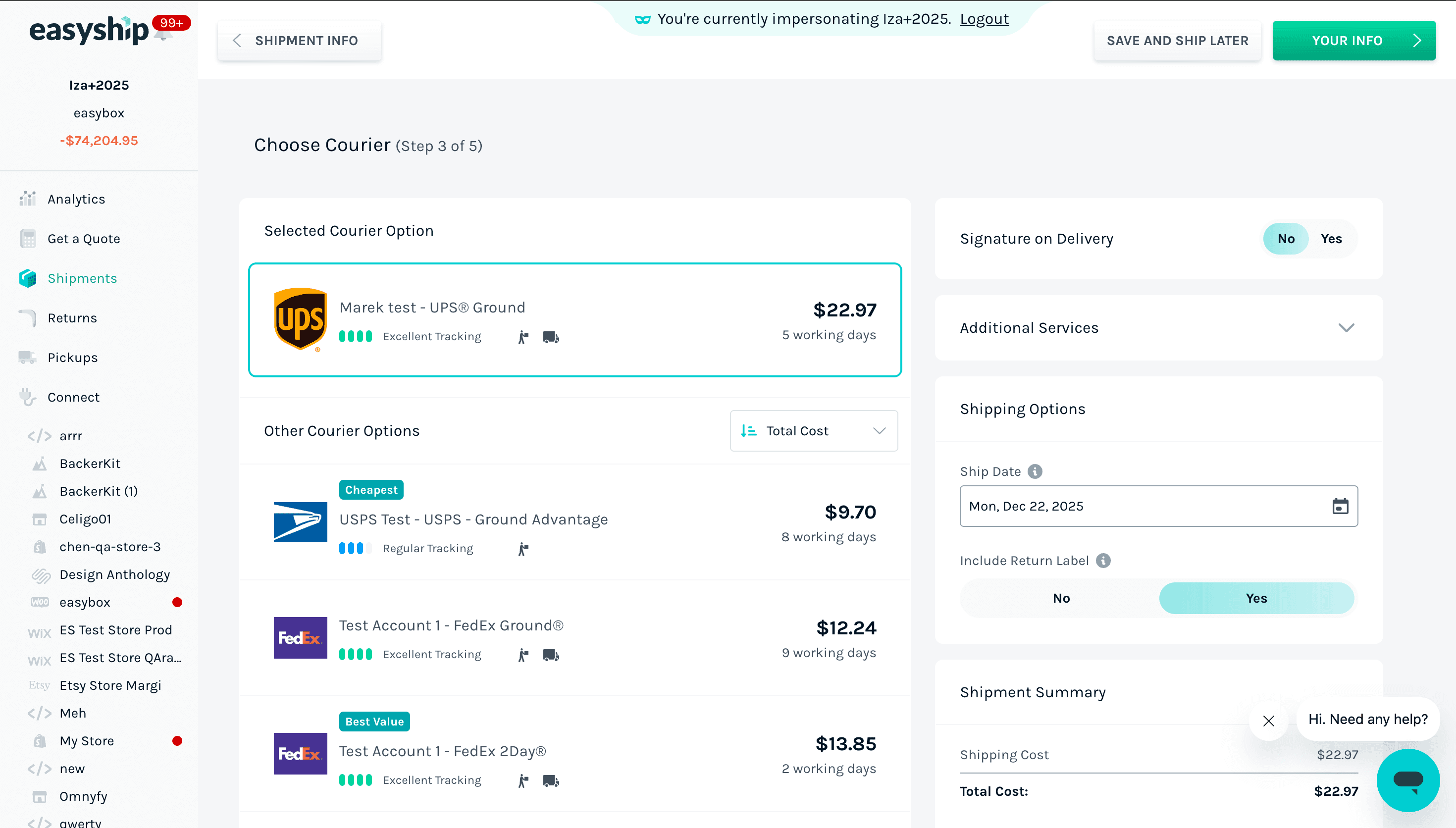
Step 3: Courier Information
Step 4: Handover & Insurance Options

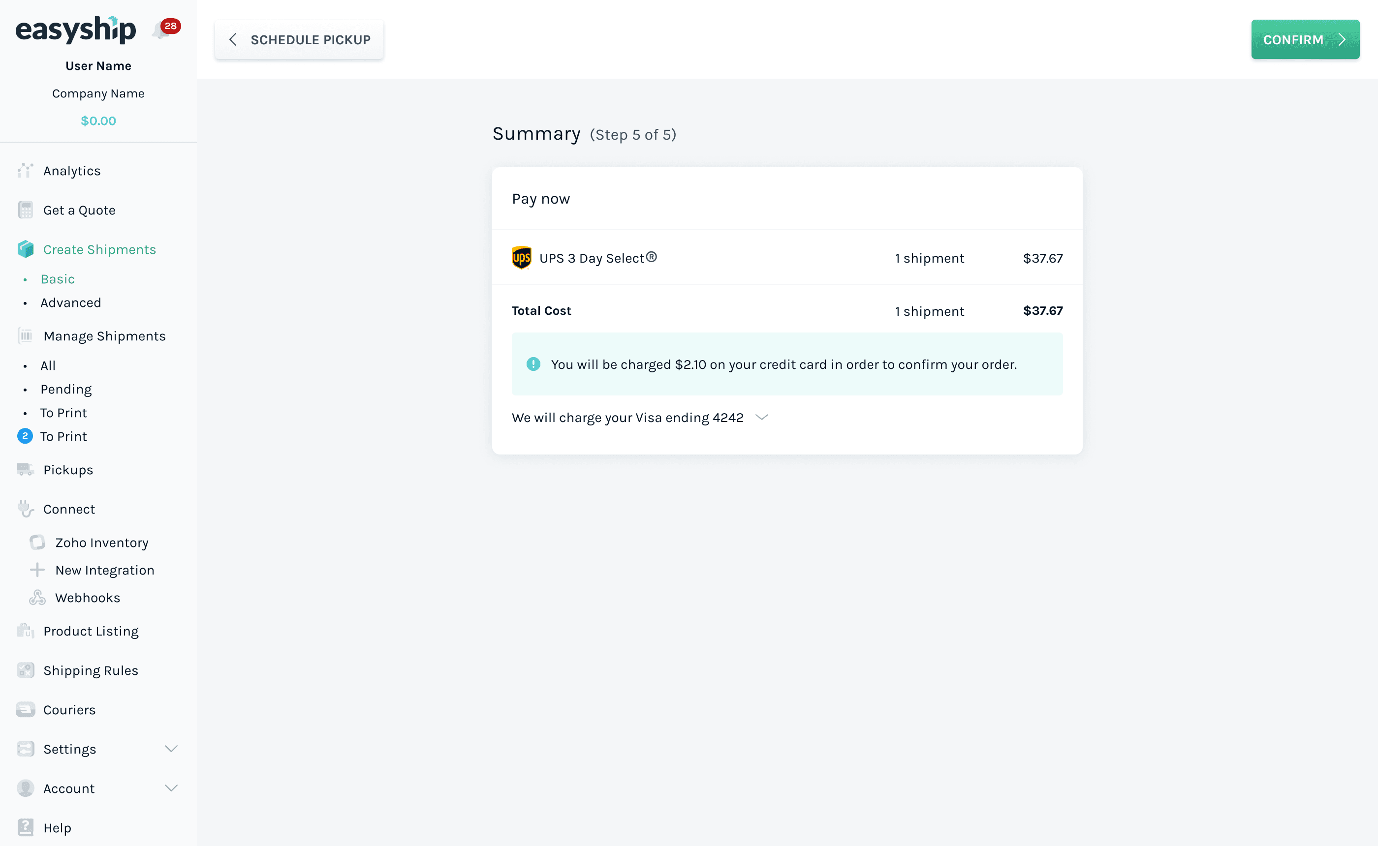
Step 5: Payment and Summary
[Challenge]
Interdependent fields
The optional/ mandatory field changes, based on certain cases e.g. domestic vs international, insured vs uninsured shipment, single box vs muti-box shipment etc. And permutations and combinations of these cases + country specific requirements.
[Challenge]
Need for speed
The UX is optimised for the new user, for power users the multi-step approach slows them down.
[Challenge]
Too much to & fro
Various fields currently spread across different screens, affect various consequent options and in many cases the price itself. The ability to tinker these is crucial for the price sensitive small businesses.
[Challenge]
Information heavy nature of the form
The user will get overwhelmed with the amount of information, if we try to combine them on a single scroll.
NEW
DESIGN
Long scroll form with anchored sections for easy navigation and habit building.
Go ahead,create a shipment. One scroll, no gated steps, no clicking back to check what you entered, and the rate recalculates right where you set the box and weight. Every tap this saves is one a power user would repeat across forty-plus labels a day. Built to be filled again and again, not just once.
Addresses
Ship From
Ship To
Shipment
Some couriers provide very limited to no compensation in the event of loss or damage. Secure your shipment with Insurance.
Note: Certain electronic devices are not insurable. Terms and Conditions
WHERE?

WHAT?
HOW?
Information Structure
It was very important to put down a all the dependent and independent input fields to help structure the form. It helped us sort the bare minimum amount of information required to create label. Thus determining the shortest path to success, then I worked on organising it into smaller logical buckets, to create a successful logical hierarchy.


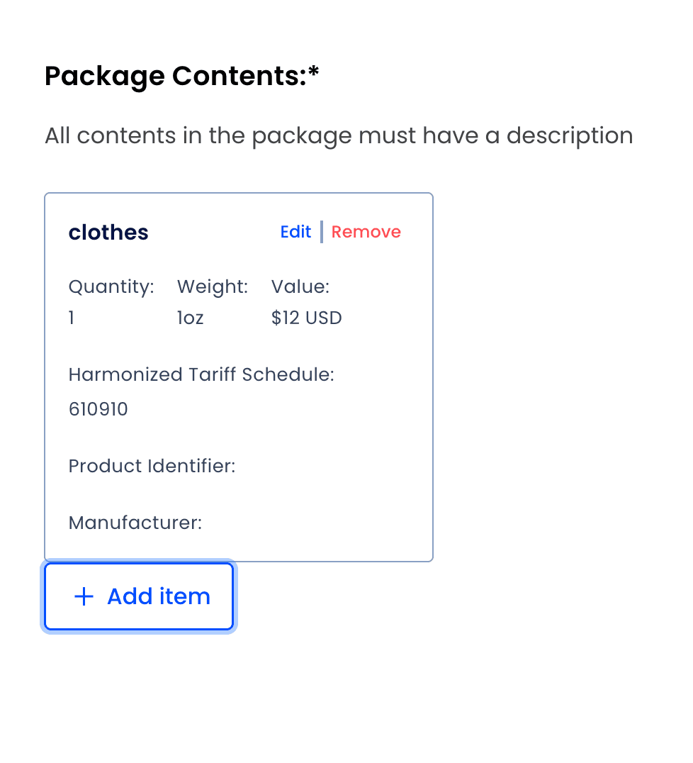
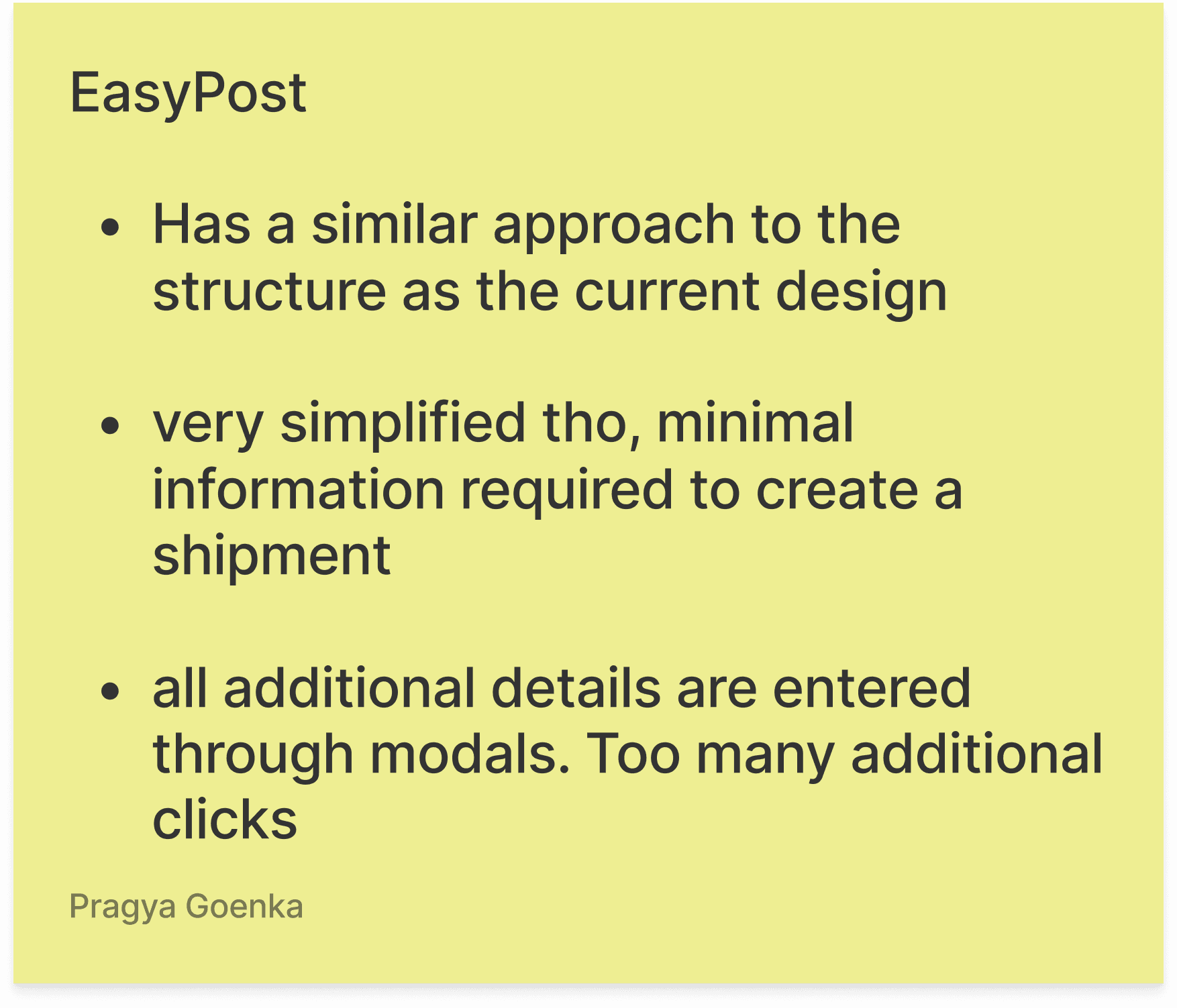
Competitive Audit



Key Product Decisions
Before designing screens, I worked through the decisions that would shape the whole experience. A few mattered more than the rest, and each one came with it's own challenge.
Zoooming Innn……
Although the restructuring the form was a big enough change, the structure in general needed to be flexible to accommodate additional or special fields each to it's own case depending on the receiver's country & international laws. Other than reducing, over information and visual noise, this was another reason to look at, evaluate and rethink each section,card, & input.
Hide & Seek
Where
Being the first section, a lot of visual and structural guidelines were created to ensure visual consistency and coherance to manage the heavy information. The first question was what deserves user's attention, when and for how long. For each section combine all the optional datapoints under a single umbrella to hide them behind a collapsible card, was ideal. The fields are nicely hidden behind the card, listing all the fields inside for users looking to input those data points. But wherever that was not possible, these inputs are hidden behind "+ add <data point>" buttons under there own headings (this is still better than showing those inputs, as it avoids over whelming the user with the number of empty inputs).
A Russian Doll
What
The challenge here was mapping the hierarchy of information, by determining & documenting the relationship between the different data points, to design a layout that accommodates the different scenarios by coming up with a logic of what input field reveals themselves, when & where in the interface.
(This was easier than identifying and documenting permutation and combinations of each data points in 100+ unique cases possible based on different countries, services and routes.)
This hierarchy needs to reflect in the layout, so how to organise: item, box and shipment. Now, a shipment can have multiple boxes( due to items in the same order being in different warehouses, or it is cheaper to split a large order). But that raises the question that do we declare items for customs and insurance purposes, at the shipment level or the box level? This matters because if items are declared at the shipment level, we can structurally combine them with insurance and give them their own space(specially given the amount of data points needed for each item is increasing with every new regulation). But it would be misguiding if they need to be mapped to individual boxes andhow to collect that information in cases necessary. Also, now the question was do we allow them to insure partial shipments? And after creating 50+ test shipments daily, connecting with the exports teams and reading up on some import regulations with the help of my trusty Claude, The structure was clear, items are mapped to boxes, insurance is shipment level and the hierarchy is an order can have multiple shipments, a shipment can have multiple boxes, and each box has it's own items.


Keeping it Constant
How & How much
One very conscious decision was to keep the order of the inputs similar to the earlier layout, irrespective of their required status. So, even if we know through 5 years of historic data that more than 80% users don't fill order details when creating shipment manually, the collapsed card is still prioritised in the hierarchy over the shipment card because merchants who wants to access it, will find it at the same architectural location.
And it worked, internal users (despite of having muscle memory for the old form) were able to complete the form in one go without spending any additional time looking for required input fields.
User Testing
And the new design proved to be ~1s faster than the old design.
User testing isn't new to me. But at ~$100 per participant, the pressure was real. I had to present a jargon-heavy, tedious form to industry veterans who’ve been at this before I was even graduated. Prototypes had to be rock-solid, any flaw would instantly confuse the user.
Business Owners
EU-US Region
Paid Audience
21
External Users
They were instructed to generate a label in the old form and the new design. This is a truer test of the reduced friction in the UX as the timings wouldn't be skewed by the habit or familiarity of the old design. And? And the new design was actually a whole new second faster! I even made 2 different tests to reverse the order of the experience show to the subjects, to avoid any bias, the results were consistent.
Prefers New Form
I like the scrolling to get to the next step. Rather than moving down, then having to go to the top right every time to Continue, it feels more like a flow.
Prefers New Form
This option has everything in a single page, making it easier to follow and it is more organized
Prefers Old Form
Much easier to read and focus on each individual step and ensure I understand everything and have filled it out completely.
Business Owners
EU-US Region
Proven Usage History
62
Internal Users
Asking these clients was trickier, since these surveys usually add friction to daily work. So we swapped prototypes for short animated GIFs, targeting users by their label-creation medium over the last 30 days and surveying anyone averaging 5+ labels in 2 days with a two-video preference poll (plus an optional Lyssna prototype test of just the new concept). Over 70% preferred the new experience; the ~29% who didn't were worried about re-learning curve, not the layout or inputs itself.
Prefers New Form
Important to be able to retroactively look at previous info entered without going back screens (e.g the shipment summary says 2lb, but i scrolled up to see if i remebered correctly that it was actually 5lb).
Prefers New Form
Scrolling on one screen instead of having to do multiple clicks on multiple screens should probably be easier and faster.
Prefers Old Form
Dont change platform when we have already get used to it
*Note how I have mentioned the inferences directly instead of raw numbers? I wasn't sure if anyone would be interested in the carefully devised test structure and scale and so, if the average rating or score would make sense without the context of the scaffolding it was set in. So, you get the "present it to the founder" version.
After maintaining and synthesing 8 different tests across lyssna, appcues, google sheets and mix panel, the sweet proof of concept validation was indeed tasty.
So, after documenting 128+ states for different components and sections the designs were shipped off to increase the number of figma files to be picked up by tech next quarter as scheduled and they lived happily ever after.(Hopefully👍)
Looking for my next Big Adventure
Every design has a story;
I'm here to listen and try to
tell mine.

बाबुमोशाय, ज़िंदगी बड़ी होनी चाहिए, लंबी नहीं...


Hi! I am Pragya Goenka, a product designer.
Enjoy the experience on a desktop screen, instead of scrolling through a long mobile page.

PRAGYA GOENKA